Homepage vs landing page vs sales page: What’s the difference?
May 23, 2023
I'm Katie
Categories
Category
Category
Category
Category
Category
Category
Are you trying to write your website and overwhelmed about where to even start?
There are the basic pages that should be included in almost any website outline, which are the home page, about page, services page, and a contact page.
But once those are up and running, there are actually more pages to create that will help you connect with the right clients more quickly and accurately.
Today we’re talking about the differences between homepages, landing pages, and sales pages.
Homepage
This page probably feels self-explanatory, as it should! If you’re a human who regularly uses the internet (I’m assuming you are), you probably interact with a few homepages every day. This is the page that gives a general overview of your business to your readers.
Ideally a homepage will present the story of your business in a way that’s easy to skim and helps your audience quickly understand the most important details of doing business with you. While every page on your website should be targeted to your ideal client, this page should be the most broad in comparison to a landing or sales page.
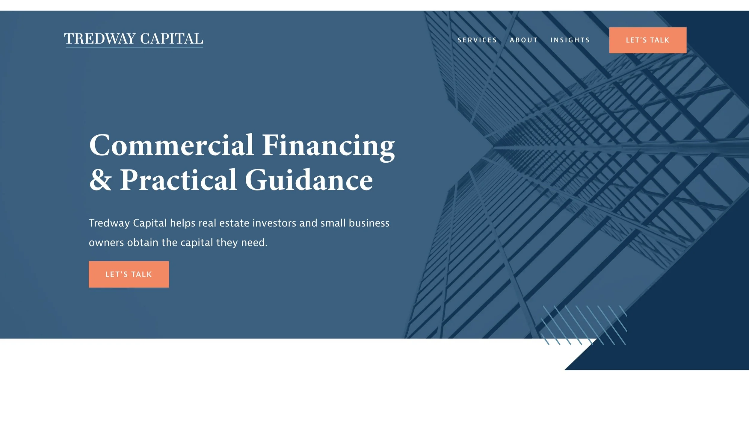
Here’s an example from the top of one of our client’s homepages. The header of this page immediately tells the audience what they’re getting when they work with Tredway Capital, and they have options for how to navigate from the homepage to learn more. As you scroll down the page, more information is provided that could apply to most anyone who lands on this page.
Sales page
Next is the sales page. These pages will typically be accessible through your website’s navigation bar and are targeted for a customer looking at a specific item or product offering.
Traditional sales pages tend to be lengthy and packed-full of information. The clients on these pages are there because they’re really considering making a purchase, and this is the place to provide all of the information that will aid them in their decision-making process!
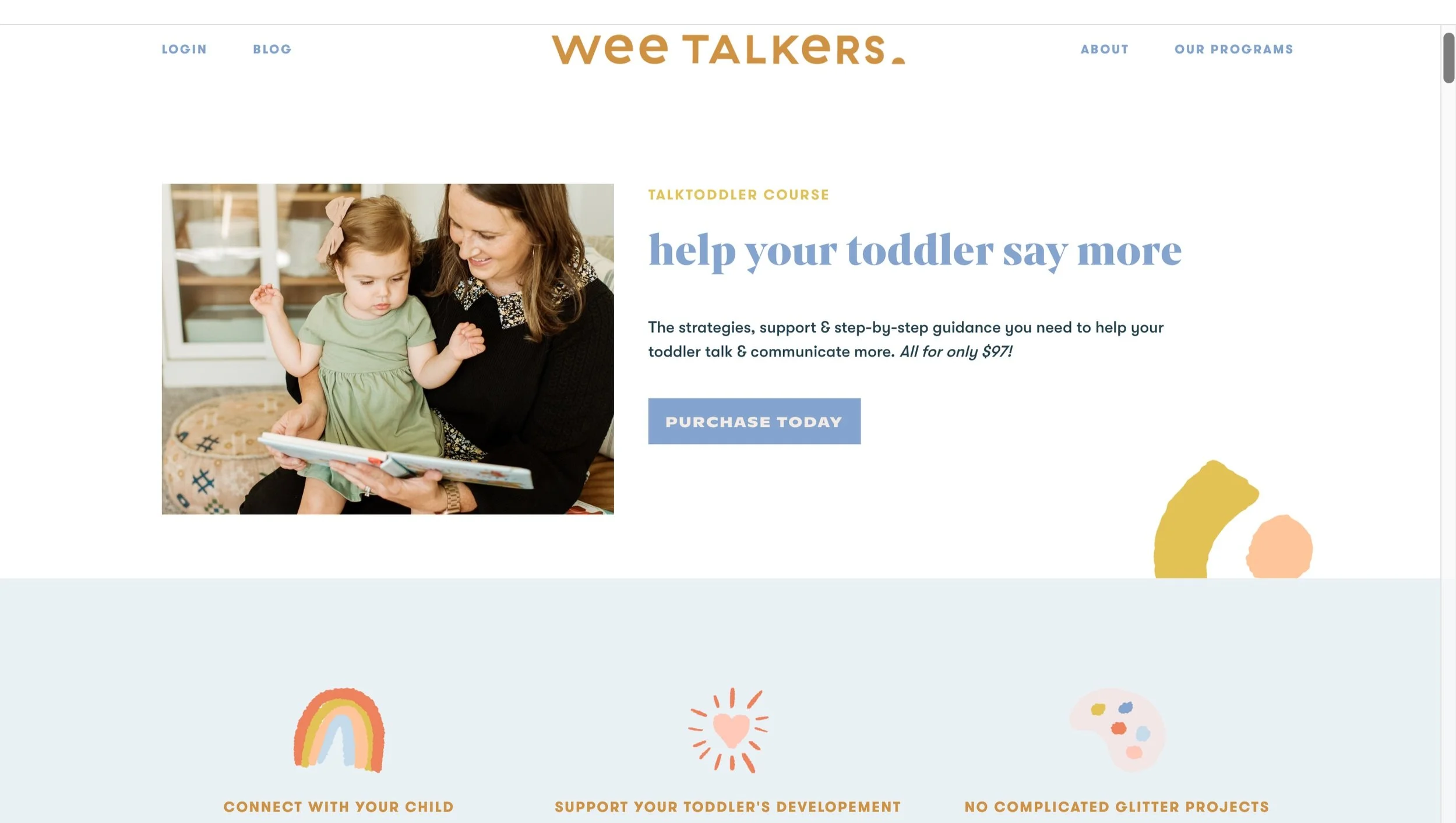
Our friends at Wee Talkers have multiple sales pages on their site for their 3 different products.
This page is created specifically for parents who are interested in the Talk Toddler course. While the Wee Talkers homepage features a variety of photos of younger and older children, this page is intentional to be about and for toddlers specifically.
As you scroll down the sales page, you receive plenty of information that will inform you to make a decision. It is longer than a traditional homepage and shorter than a landing page.
Landing page
Lastly, your landing pages. Similar to the sales pages, landing pages are also specific and focused on conversion – but rather than a focus on high-cost conversion, landing pages are often hyper-targeted to a subset of your audience, and their goal is to sell either a freebie or low-cost service. Landing pages are rarely accessible from your regular website, but rather clients who come to your landing pages have been sent there directly from an ad or link that you provided for them.
For example, Murphy Marketing’s website has a homepage that speaks to our entire audience’s overarching needs, but our individual landing pages are focused on topics like “storybrand guide workshops” and “website development” etc.
These topics are important elements of our company, but don’t necessarily appeal to the largest scope of our audience.
We don’t want a general client to get lost in the weeds of a dozen different subpages on our site, but we also want to show up for those smaller clients that we can serve in unique ways.
That’s why landing pages exist! They’re a place for a particular client to “land” and get information that’s already tailored to their needs.
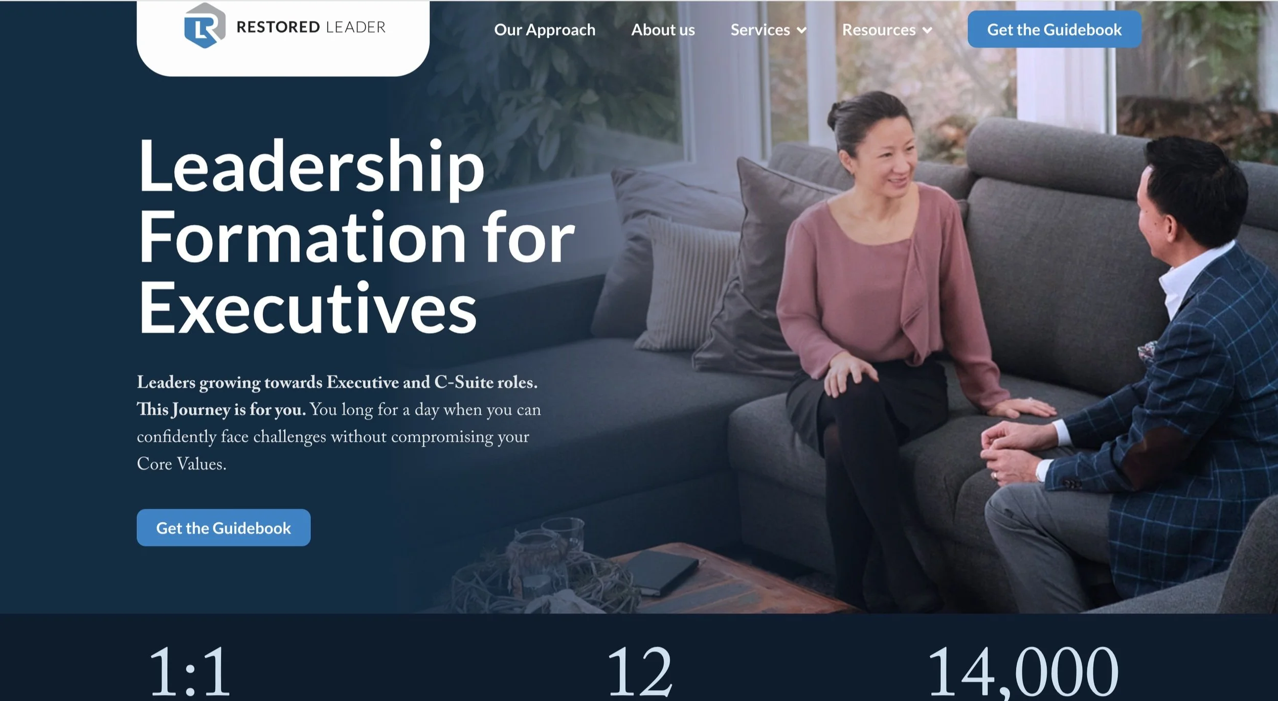
Our last example is from one The Restored Leader’s landing pages:
This page is short and to the point, directed at a specific group within The Restored Leader’s general audience. While this may sound similar to the WeeTalker’s sales page, the key difference is that this page is asking for a much smaller commitment than a long-term membership. Rather, it simply is advertising for an ebook purchase to get them acquainted with The Restored Leader.
So there you have it. Three homepages that may seem similar on the surface, but are all unique and serve specific purposes.
If you’re trying to take your business to the next level and you haven’t created a website with sales pages or landing pages, that could be one missing piece to the puzzle.
We offer design, development, and messaging for any and every website need, and we’d love to chat more about what website pages would work best for your company and help however we can!
Note: The examples listed here are all Murphy Marketing messaging & copywriting clients.


